Hey everyone!
I'm super pleased to finally be able to share the new version of the Humble Visualisations which has been overdue for a very long time!
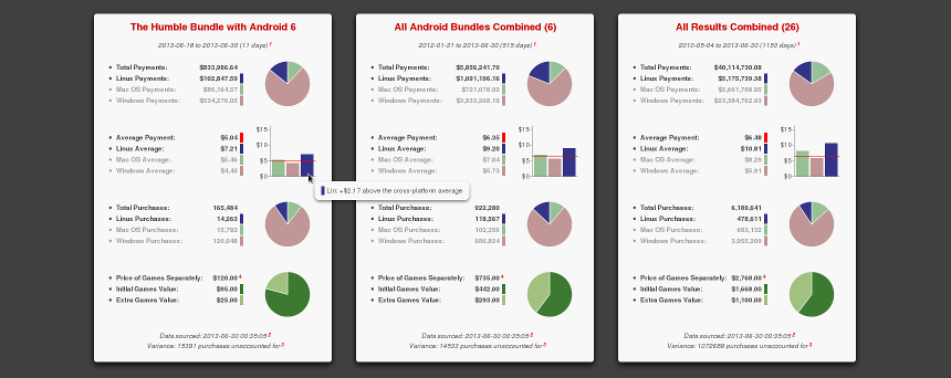
In this update, I've migrated the front end to use the awesome open source D3 visualisation library (D3 standing for Data Driven Documents), which allows for a huge amount of.interactivity that wasn't possible with the now depricated Google Image Chart API. I've also dramatically cut down the amount of data initially displayed, limiting it to focus on the current bundle and comparing it with other bundles of that type.
In the back end, I've updated and simplified the parser and now deliver data in JSON format. All the rendering work is now done client side, which trims things down a lot (at the expense of pulling in D3 as a dependency).
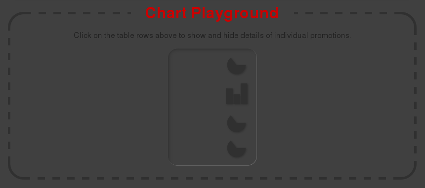
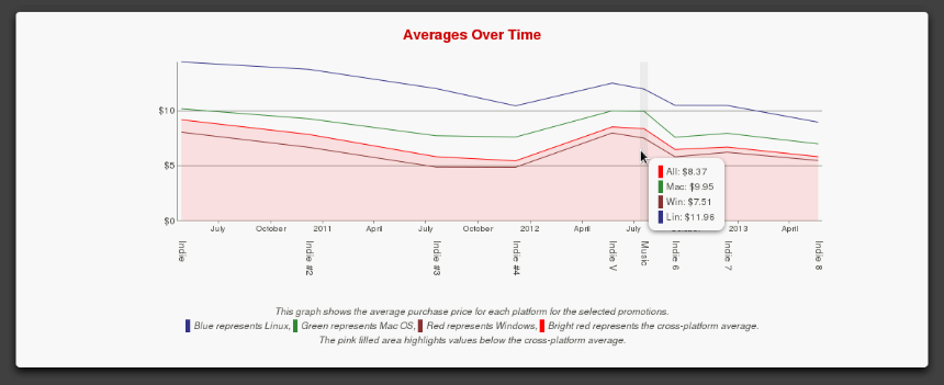
The big new feature of interest is what I'm calling the "Chart Playground", which is an area where users can show and hide stats for individual bundles to get the specific data and comparisons they're interested in - something that was pretty awkward with the previous version. Adding items to the Chart Playground also dynamically updates the Separate Price, Revenue, Purchases and Averages Over Time graphs to include whatever's shown, so if you're interested in seeing how the average prices for all the Humble Indie Bundles compare to the Humble Music Bundle and nothing else, that's now doable. Huzzah!
Enhancements/features of interest:
There's still more polish that I'm planning to add over time (including merging in the hourly data I've been collecting). If anybody wants to keep track of what's on the horizon, feel free to peruse the issue list ^_^
Enjoy!
I'm super pleased to finally be able to share the new version of the Humble Visualisations which has been overdue for a very long time!
In this update, I've migrated the front end to use the awesome open source D3 visualisation library (D3 standing for Data Driven Documents), which allows for a huge amount of.interactivity that wasn't possible with the now depricated Google Image Chart API. I've also dramatically cut down the amount of data initially displayed, limiting it to focus on the current bundle and comparing it with other bundles of that type.
In the back end, I've updated and simplified the parser and now deliver data in JSON format. All the rendering work is now done client side, which trims things down a lot (at the expense of pulling in D3 as a dependency).
The big new feature of interest is what I'm calling the "Chart Playground", which is an area where users can show and hide stats for individual bundles to get the specific data and comparisons they're interested in - something that was pretty awkward with the previous version. Adding items to the Chart Playground also dynamically updates the Separate Price, Revenue, Purchases and Averages Over Time graphs to include whatever's shown, so if you're interested in seeing how the average prices for all the Humble Indie Bundles compare to the Humble Music Bundle and nothing else, that's now doable. Huzzah!
Enhancements/features of interest:
- Timeline and revenue table are now clickable to show/hide individual bundle stats
- Pie charts are rotated -90 degrees to aid visual comparison of Linux and Mac values
- Tool tip thingies for all visualisations
- More distinct bundle types are highlighted in the timeline and revenue table
- Axes of individual bundles average charts are now normalised (everything has the same scale) to aid comparison
- Data points for other platforms are now dimmed on mouseover of data points in charts to help highlight relevant information
- A brief howto with a diagram and some details on how things work
- Source and issue tracking are now on GitHub
- New snazzy loading icon
There's still more polish that I'm planning to add over time (including merging in the hourly data I've been collecting). If anybody wants to keep track of what's on the horizon, feel free to peruse the issue list ^_^
Enjoy!
0 Likes


Some you may have missed, popular articles from the last month:
3 comments

Looks great, fun to play with! I think your dates for the first Android bundle are off, though (it says 42 days?!)
0 Likes
You constantly surprise me Cheese...
;)
;)
0 Likes
Thanks guys!
I'm having some troubles with the site at the moment that are preventing me from logging in to comment.
s_d, thanks for the heads up. #26 is now closed (it was something silly that didn't expose itself until the 29th) ^_^
I'm having some troubles with the site at the moment that are preventing me from logging in to comment.
s_d, thanks for the heads up. #26 is now closed (it was something silly that didn't expose itself until the 29th) ^_^
0 Likes
Currently working on Winter's Wake, a first person text adventure thing and its engine Icicle. Also making a little bee themed base builder called Hive Time :)
I do more stuff than could ever fit into a bio.
See more from me