If you're on the Steam Client Beta (Desktops), you might have noticed the Steam store looking a bit different with the latest update. Valve announced a refresh of the Steam store menu noting it's designed to "provide easier access to the places Steam users most frequently visit".
What's changed? A lot actually. The whole left sidebar of links is entirely gone, combined into the new store bar at the top. It also puts the bar on more pages across on Steam, to give you access to the search and links easily. It will also disappear when you scroll down, just scroll up a bit for it to reappear.
Valve have also enhanced the search bar too. It now offers more options when searching including:
- Popular Searches: See what others are searching for right now
- Recently Viewed: An easy way to jump back to games you've previously looked at
- More than just games: Search for categories/tags, publishers, and more
- Advanced Search link: For those who want to refine their game search even further, we’ve made it easier than ever to access the advanced search page with a variety of filters.
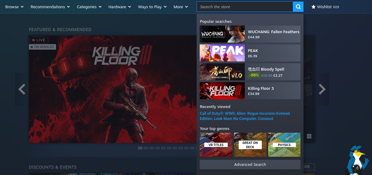
There's more including recommendations, categories and tags personalised to you and various smaller changes.
If you've tried it out in the Steam Client Beta, drop a comment to let us know what you think.
See more from me

 Xpander 7 days ago

Categories are now kinda stupid big blobs, but luckily theres show more that gives better list
Theres also lots of wasted empty space on the both sides now.
Search box now shows the price also which i dont think it previously showed, thats nice but again it has big banners on the search list and fits less titles into it..
overall pretty bad, but its been going worse for last few years already...so yeah
im old a grumpy with the "modern" designs.
 Vortex_Acherontic 7 days ago
 Phlebiac 6 days ago
Search box now shows the price also which i dont think it previously showed, thats nice but again it has big banners on the search list and fits less titles into it..
Comparing the search in the client versus on the web, using "blood" since "Bloody Spell" is in the screenshot (on sale cheap right now; picked it up and found it well worth the bargain price):
a) both old and new show the prices, but only the new makes it obvious when it's a sale price (useful improvement)
b) old shows 5 search results, new only shows 4 (making space for other stuff and keeping it short overall?)
c) both show a tag match and a developer match; the old shows a game count for them, so seems better to me
d) as far as I can tell, the "advanced search" button just duplicates clicking on the magnifying glass or hitting enter
e) old shows when things are in your library or wishlist, new does not
So comparing using those: new wins for a, old wins for b, c, and e, and I'd say old kind of wins for d, but since that's counted as b, we could call it a draw on that point. If they fix c and e, new search would be better.
 TheRiddick 6 days ago

 TheSHEEEP 6 days ago
The Steam review/comment editor looks like it was unchanged since the early 2000s.
 R Daneel Olivaw 6 days ago

I almost never use that left or top bars for navigation in the store, so I guess I will barely even notice this change. I probably should try to dive into the categories and stuff like that more often though.
 scaine 5 days ago

It's a shit design choice, and the only reason it exists is from the early days of mobile. Now, Valve are reviving it for the Deck. <sigh>
 dibz 5 days ago
This reminds me of the evolution of the Amazon website over the years, where modern UX tends to eventually turn sites unusable for browsing.
Now the Steam store is just a bunch of wasted space with things stuffed together in an inconvenient way. I don't see myself ever browsing the store like it is in the Beta, I would search for what I want specifically, go to it, and that's it.
At least they still use actual words in their interface, and the new one -- despite not caring for it at all -- is at least consistent in placement. Small victories I guess.
If they keep up with modern UX trends soon enough it'll be icons-only that don't mean anything, aren't obvious, be over-simplified in a frustrating manner, and be all over the place because some UX designer thought their unique take on things is more intuitive then familiar flows that people would just understand immediately versus having to learn their #901358 interface of the week.
Last edited by dibz on 28 Jul 2025 at 5:11 pm UTC
Eike 5 days ago
Last edited by Eike on 28 Jul 2025 at 5:47 pm UTC
Complete with an AI clerk who has really bad reccomendations and fear for their job if they dont reccommend the latest shovelware like its a big deal.
Yeah maybe this is better but Ibdo tire the flat menus.
Least its getting better overtime and I like to be able to search for developers and publishers more.
Now if we could just use publishers and devs as a tag for my collections in my library automatically instead of having to build it myself but maybe Im lazy.
Phlebiac 4 days ago
if we could just use publishers and devs as a tag for my collections in my library automatically
More options for automatic collections would indeed be useful.
 Ehvis 4 days ago
I have no opinion on it though. I don't really use the store from the client at all, which is why I hadn't noticed it.
 How to install Battle.net on Linux, SteamOS and Steam Deck for World of Warcraft and Starcraft
 How to play games from GOG and Epic Games on Linux, SteamOS and Steam Deck