Valve have pushed out an overhauled Steam store home page in the latest Steam Client Beta, along with another needed fix for the Linux SteamRT3 Beta. In case you missed the big news for Linux gaming fans - the Linux SteamRT3 Beta brings Steam inside a container with 64bit support! A long time coming, and should improve compatibility across all the many different Linux distributions.
As for the new refreshed Steam home page, Valve gave more information in a standalone announcement going over some of the changes. Currently, it only shows in the client, not on the web - but they'll roll that out when it's ready to everyone. It includes higher resolution game art and the store is wider and more responsive too. A similar update to what Valve did for game store pages recently.
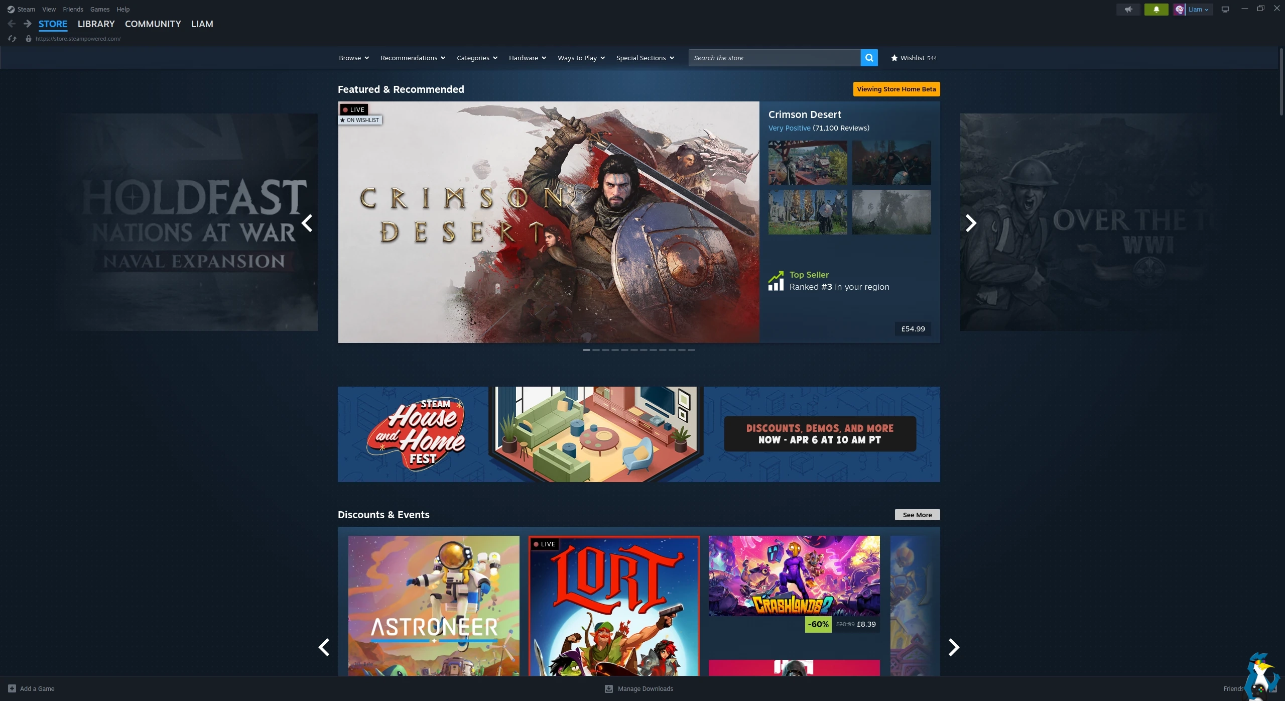
The main store home page changes:
Updates
- Overall Design Refresh: Over the years we've introduced new sections and added new ways for you to discover and learn about games, and this update aims to make the store home feel more cohesive. Each section has a distinct set of tools and information to give users many ways to explore the diverse catalog of games on Steam. A goal of this visual refresh is to strike a balance between providing more consistency in UI elements, while allowing the unique nature of each section to show through.
- Featured & Recommended: There is now more detailed information highlighting the reason a game is being recommended to you; plus a user review round-up. When hovering over a game's cover art, the game's micro-trailer will play for a quick peak at the action. We also added a sneak-peek of the adjacent games in the carousel.
- Option to disable: Micro-trailer hovers and animated marketing assets can be disabled in Store Settings for users with motion sensitivity.
- Discounts & Events: Now uses larger game artwork.
- Updated Discovery Queue: A quicker way to browse titles in your Discovery Queue without leaving the page.
- Better Hover States: A short description is presented along with other relevant information. The UI is updated to provide better contrast and legibility.
- Infinite Scroll: Refreshed design to bring this part of the store home in line visually and functionally with the rest of the sections.
New Sections
- Your Wishlist: This section, as you might guess, features games on discount from your wishlist.
- DLC for Your Games: This section will feature DLC that's on discount for games from your library.
From the main Steam Client changelog:
General
- Enabled the refreshed Steam Store home page
Linux SteamRT3 Beta
- Fixed Steam tray icon not showing.
Big Picture
- Updated the Store main menu option to navigate to the Steam Store home page instead of the Great On Deck hub
Cloud
- Fixed an issue which could lead to data loss when uninstalling, reinstalling, and playing a game without restarting the client in between
What do you think to the changes? Let us know in the comments!
See more from me

 StalePopcorn 7 hours ago


well thats not steam only issue ofc. Every freaking site does that these days :(

Quoting: XpanderWhy on earth is there so much empty space. Everything is squished into the middle. I have my monitor in landscape not portrait ffs.On second look... GoL does it, too. :D
well thats not steam only issue ofc. Every freaking site does that these days :(
Well, I wouldn't want to see your comment stretched over the whole monitor, and I'm happier with empty space than say adds.
 Liam Dawe 2 hours ago

Quoting: XpanderWhy on earth is there so much empty space. Everything is squished into the middle. I have my monitor in landscape not portrait ffs.The main reason being: readability. For games, having the area across the whole massive monitor makes a lot of sense. It pulls you in, draws you into the world, helps engross you.
well thats not steam only issue ofc. Every freaking site does that these days :(
But for reading anything, stretching across such a wide area is overall pretty poor. I'm sure there must have been studies on it I read somewhere. It's about not overloading people.
would be very readable imo. I just don't like scrolling that much.
something like youtube has for example.. with navigation bar on the left.. though youtube has gone worse over times also so i have to use the rowfixer extension to have more videos in row.
edit: i think its just because everyone designs the sites for mobile scrolling or something these days. I could be wrong ofc.
Last edited by Xpander on 2 Apr 2026 at 1:27 pm UTC

Quoting: XpanderWhy on earth is there so much empty space. Everything is squished into the middle. I have my monitor in landscape not portrait ffs.Not everyone displays one program at a time taking up the whole monitor. Some people have multiple programs side by side on their widescreen monitor.
well thats not steam only issue ofc. Every freaking site does that these days :(
Quoting: VigilYes, but that's what Responsive Design is all about.Quoting: XpanderWhy on earth is there so much empty space. Everything is squished into the middle. I have my monitor in landscape not portrait ffs.Not everyone displays one program at a time taking up the whole monitor. Some people have multiple programs side by side on their widescreen monitor.
well thats not steam only issue ofc. Every freaking site does that these days :(
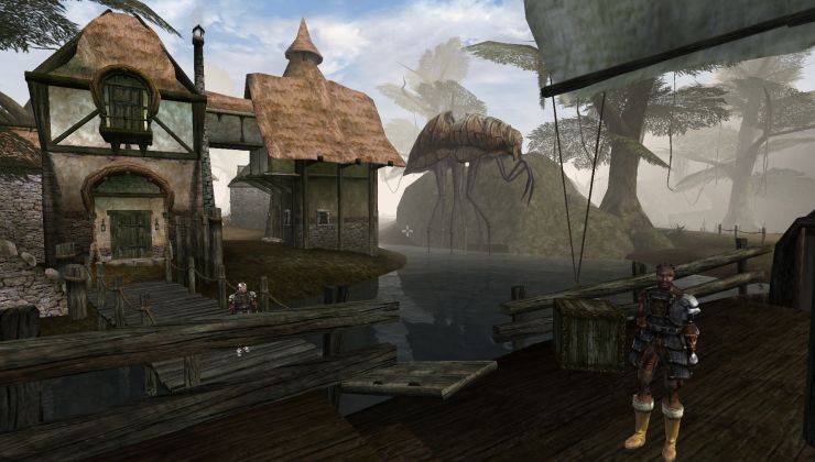 How to setup OpenMW for modern Morrowind on Linux / SteamOS and Steam Deck
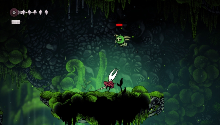 How to install Hollow Knight: Silksong mods on Linux, SteamOS and Steam Deck