While you're here, please consider supporting GamingOnLinux on:
Reward Tiers: Patreon. Plain Donations:
  PayPal.
This ensures all of our main content remains totally free for everyone! Patreon supporters can also remove all adverts and sponsors! Supporting us helps bring good, fresh content. Without your continued support, we simply could not continue!
You can find even more ways to support us on this dedicated page any time. If you already are, thank you!
Reward Tiers:
This ensures all of our main content remains totally free for everyone! Patreon supporters can also remove all adverts and sponsors! Supporting us helps bring good, fresh content. Without your continued support, we simply could not continue!
You can find even more ways to support us on this dedicated page any time. If you already are, thank you!
Login / Register
- Legendary, the free and open source Epic Games Launcher, has moved to a new organisation
- Godot gets a funding boost from Slay the Spire 2 devs Mega Crit
- Bazzite Linux gets some major upgrades for the April 2026 Update
- Valve dev fixes up VRAM management on AMD GPUs to improve performance
- Proton Experimental brings fixes for classic Resident Evil 1 & 2, Dino Crisis 1 & 2 and more
- > See more over 30 days here
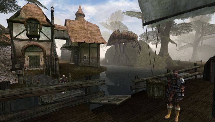 How to setup OpenMW for modern Morrowind on Linux / SteamOS and Steam Deck
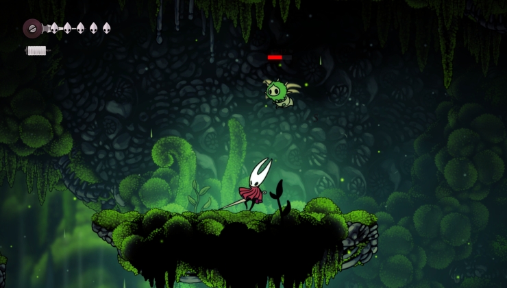 How to install Hollow Knight: Silksong mods on Linux, SteamOS and Steam Deck
Recently Updated
- video buffer overflow
- LoudTechie - Retrieve root (Desktop mode) without factory reset
- LoudTechie - The Great Android lockdown of 2026.
- grigi - New Desktop Screenshot Thread
- DoctorJunglist - To wait or not to wait
- GustyGhost - See more posts
Also, the "Create Post" button in the dark theme has blue text on a slightly different blue background.
Feel free to note more down here.
Maybe what some of you want is a third, separate low-contrast theme? Not sure Liam's up for it though.
I've also adjusted the text, it's not so blinding white now while still being very clear to read longer paragraphs.
Also, the tags and share buttons on the article page pop out as the most important thing on the page. Those could be toned down a bit.
Personally I do think the whole background is too dark for day time use. Where I sit right now there is very little contrast between the boxes itself. Of course this isn't helped by having several PDFs open across my screens.