While you're here, please consider supporting GamingOnLinux on:
Reward Tiers: Patreon. Plain Donations:
  PayPal.
This ensures all of our main content remains totally free for everyone! Patreon supporters can also remove all adverts and sponsors! Supporting us helps bring good, fresh content. Without your continued support, we simply could not continue!
You can find even more ways to support us on this dedicated page any time. If you already are, thank you!
Reward Tiers:
This ensures all of our main content remains totally free for everyone! Patreon supporters can also remove all adverts and sponsors! Supporting us helps bring good, fresh content. Without your continued support, we simply could not continue!
You can find even more ways to support us on this dedicated page any time. If you already are, thank you!
Login / Register
- Oh dear - ARC Raiders was logging your private Discord chats [updated]
- Many more US states are planning or already have operating system age verification laws
- Xbox "Project Helix" confirmed to run Xbox and PC games - competition for the Steam Machine
- Transport Fever 3 confirmed for Linux and macOS support
- Slay the Spire 2 is out now in Early Access with online co-op
- > See more over 30 days here
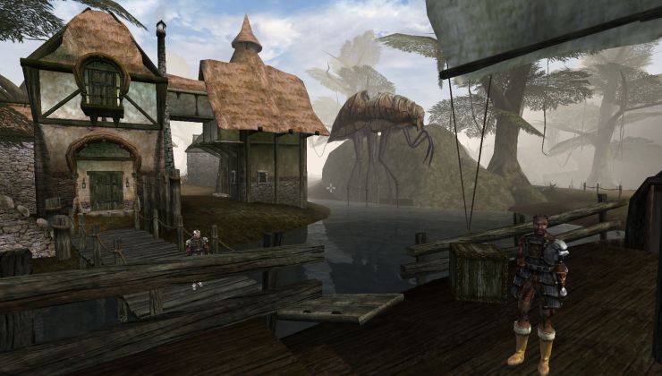 How to setup OpenMW for modern Morrowind on Linux / SteamOS and Steam Deck
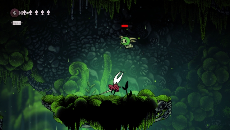 How to install Hollow Knight: Silksong mods on Linux, SteamOS and Steam Deck
Recently Updated
- Do you miss LaunchBox/Playnite on Linux?
- Dark574 - Recommendations for portable monitor for Steam Deck?
- childermass - Shop Crush - Psychological Horror Thrift Sim with Literal Illusio…
- hollowlimb - Introduce Yourself!
- hollowlimb - Proton/Wine Games Locking Up
- Caldathras - See more posts
[03](https://ibb.co/WFmYLZ6) - [02](https://ibb.co/hM1hdmY) - [01](https://ibb.co/svrKY2z)
Observations
- Notice the sections on the top menu were altered.
- Icons at the upper right represent, from left to right: Sales, Mailing List, Wiki and Contact Us. If you hover the mouse over them a message should appear indicating what they mean.
- The "Livestream" chart is meant to act like a scrolling marquee. Once one announcement finishes, then the following one appears, as marked on the five dots under the chart, at the left side. If you click the chart it should direct you to the Livestream Calendar section. You can re-check every announcement by pressing the dots, obviously.
- The pop-up menu on image 2 should appear if you click on the search bar.
- The lower right black chart is meant to be fixed and aligned with the "Support Us" chart, hence the "Popular this week" chart is "cut" at the bottom on images 1 & 2 (the blue line on the lower border makes it obvious that the text was "interrupted" intentionally).
- Once you start scrolling down past the "Support Us" chart, then the lower right black chart will be "released", as seen on image 3, and you'll be able to see the "Last Comments" and "Last Forum Posts".
However I'm not a fan of the search box being moved. The reason it's in the top bar is so that it can be accessed at all resolutions (including mobile with a pop-out button). Moving it makes no sense. The All News button also needs to be available easily, without having to know it's in the search box. The reason being: people block tags, hitting that buttons shows all without blocking tags so it needs super quick access.
Burying the support us box down below I'm also not a fan of, the reason it's at the top is so that it's clear and prominent, to make sure users are aware we're supported by users.
The scrolling livestreams bit is interesting, however the GOL livestream bar is staying as a bit by itself because it's official and I don't want it bundled into others. I could possibly adjust the sidebar to allow scrolling through them without visiting the page :)
Last edited by GamingOnLinux Bot on 24 Oct 2019 at 10:54 am UTC