The release many GNOME fans have been waiting for is here and it's looking really fancy. GNOME 46 available now brings on experimental variable refresh rate (VRR) support. There's masses more of course!
While I'm a KDE Plasma user and fan myself, I'm still impressed by all the features and small touches the GNOME team manage to keep bringing to the table too. Competition is great, even for desktop environments.
Some of what you can expect to see includes performance improvements, bumped up security, rendering improvements for a better looking interface, a new global search feature, a big upgrade to the file manager with better performance and a sleek looking dynamic progress indicator for file operations, support for Microsoft OneDrive in their online accounts system, a new dedicated remote login option, tons of improvements to the system settings app, various accessibility improvements and the list goes on.
Check out their release video:

Direct Link
Nice to see some of the funding from the likes of Sovereign Tech Fund and Igalia be put to good use across various features.
It's pretty safe to say this is looking like one of the best releases of GNOME for a while. Fantastic stuff. I really must resist the urge to desktop-hop because I need to be productive. But — new shiny things are calling.

See the full release notes for more.
See more from me


 walther von stolzing 20 Mar 2024

Quoting: wvstolzingSpeaking of GNOME (which I've gone back to using), I recently found out about this issue on the official gitlab: https://gitlab.gnome.org/GNOME/gsettings-desktop-schemas/-/issues/52 — there seems to be a serious initiative to replace Cantarell as the UI font, with Inter. I really hope this gets carried through.I pay little attention to fonts. What's the difference between the two?
walther von stolzing 20 Mar 2024
Quoting: Purple Library GuyOn gitlab they mention missing glyphs in Cantarell; though that isn't its worst shortcoming, IMHO. The kerning just seems off, and in various combinations, the 'a's, 'e's, and 'l's look as though they're slightly shifted to the left or right; which all result in a jarring, uneven look. There are no italics; and I believe the bold version is missing even more glyphs. Overall it looks amateurish; which isn't surprising, as it was originally designed for a university course assignment, and later fixed up a little to become GNOME's ui font.Quoting: wvstolzingSpeaking of GNOME (which I've gone back to using), I recently found out about this issue on the official gitlab: https://gitlab.gnome.org/GNOME/gsettings-desktop-schemas/-/issues/52 — there seems to be a serious initiative to replace Cantarell as the UI font, with Inter. I really hope this gets carried through.I pay little attention to fonts. What's the difference between the two?
Inter's glyphs look a bit too square-ish, I think; but at least they're perfectly consistent; so you don't get the occasional lumpy look. I think elementary os uses it for their UI; it's also becoming popular on webpages -- see, e.g., https://forgejo.org/
Either Noto Sans or Inter would make a better ui font for GNOME, I think -- or even IBM Plex Sans.
 Mershl 20 Mar 2024
Quoting: wvstolzingI've been using Inter on both desktop and notebook for 4 weeks now and I quite like it. I agree it would be a great successor to Cantarell. If you wanna give it a try and are on Fedora there's an package called `rsms-inter-fonts` (`inter-font` on Arch), afterwards set Interface, Document and Legacy Window Titles to `Inter Regular` in gnome-tweaks (size 11 is default).Quoting: Purple Library GuyOn gitlab they mention missing glyphs in Cantarell; though that isn't its worst shortcoming, IMHO. The kerning just seems off, and in various combinations, the 'a's, 'e's, and 'l's look as though they're slightly shifted to the left or right; which all result in a jarring, uneven look. There are no italics; and I believe the bold version is missing even more glyphs. Overall it looks amateurish; which isn't surprising, as it was originally designed for a university course assignment, and later fixed up a little to become GNOME's ui font.Quoting: wvstolzingSpeaking of GNOME (which I've gone back to using), I recently found out about this issue on the official gitlab: https://gitlab.gnome.org/GNOME/gsettings-desktop-schemas/-/issues/52 — there seems to be a serious initiative to replace Cantarell as the UI font, with Inter. I really hope this gets carried through.I pay little attention to fonts. What's the difference between the two?
Inter's glyphs look a bit too square-ish, I think; but at least they're perfectly consistent; so you don't get the occasional lumpy look. I think elementary os uses it for their UI; it's also becoming popular on webpages -- see, e.g., https://forgejo.org/
Either Noto Sans or Inter would make a better ui font for GNOME, I think -- or even IBM Plex Sans.
Quoting: wvstolzingThanks, that does sound worth a change. Cantarell sounds like it might not internationalize that well, too.Quoting: Purple Library GuyOn gitlab they mention missing glyphs in Cantarell; though that isn't its worst shortcoming, IMHO. The kerning just seems off, and in various combinations, the 'a's, 'e's, and 'l's look as though they're slightly shifted to the left or right; which all result in a jarring, uneven look. There are no italics; and I believe the bold version is missing even more glyphs. Overall it looks amateurish; which isn't surprising, as it was originally designed for a university course assignment, and later fixed up a little to become GNOME's ui font.Quoting: wvstolzingSpeaking of GNOME (which I've gone back to using), I recently found out about this issue on the official gitlab: https://gitlab.gnome.org/GNOME/gsettings-desktop-schemas/-/issues/52 — there seems to be a serious initiative to replace Cantarell as the UI font, with Inter. I really hope this gets carried through.I pay little attention to fonts. What's the difference between the two?
Inter's glyphs look a bit too square-ish, I think; but at least they're perfectly consistent; so you don't get the occasional lumpy look. I think elementary os uses it for their UI; it's also becoming popular on webpages -- see, e.g., https://forgejo.org/
Either Noto Sans or Inter would make a better ui font for GNOME, I think -- or even IBM Plex Sans.
walther von stolzing 20 Mar 2024
Quoting: MershlI've been using Inter on both desktop and notebook for 4 weeks now and I quite like it. I agree it would be a great successor to Cantarell. If you wanna give it a try and are on Fedora there's an package called `rsms-inter-fonts` (`inter-font` on Arch), afterwards set Interface, Document and Legacy Window Titles to `Inter Regular` in gnome-tweaks (size 11 is default).Thanks; I should use the packaged version indeed, I currently have it installed manually.
One question: is there a way to set opentype features for Inter as UI font? I'd like to turn on the disambiguation set for 'I' & 'l' (ss02); though neither on gnome-tweaks, nor on dconf-editor, can I find a setting. I hope it's not like a compile-time parameter to Pango.
 Dana Souly 20 Mar 2024
pleasereadthemanual 20 Mar 2024
Dana Souly 20 Mar 2024
pleasereadthemanual 20 Mar 2024

While I'm a KDE Plasma user and fan myself, I'm still impressed by all the features and small touches the GNOME team manage to keep bringing to the table too.I use both. KDE on my NVIDIA card because the Wayland experience is better, and GNOME on my laptops because I really like GNOME. I don't have a preference necessarily, but new GNOME updates are always more exciting.
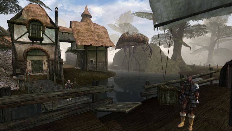 How to setup OpenMW for modern Morrowind on Linux / SteamOS and Steam Deck
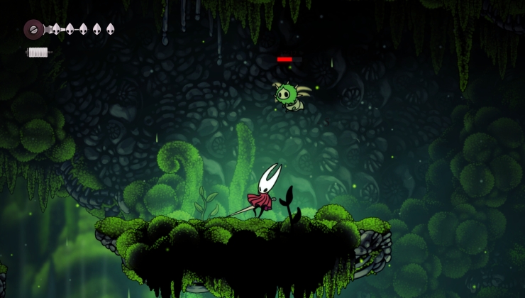 How to install Hollow Knight: Silksong mods on Linux, SteamOS and Steam Deck