Steam Deck / Big Picture Mode users rejoice, the newer Steam Store home page has been fully upgraded and rolled out to everyone now.
This newer design brings Steam more inline with what they're doing across the rest of the store. And, since they've added quite a lot of things over the years - they needed to clean it up a bit and actually make use of some of what they've added.
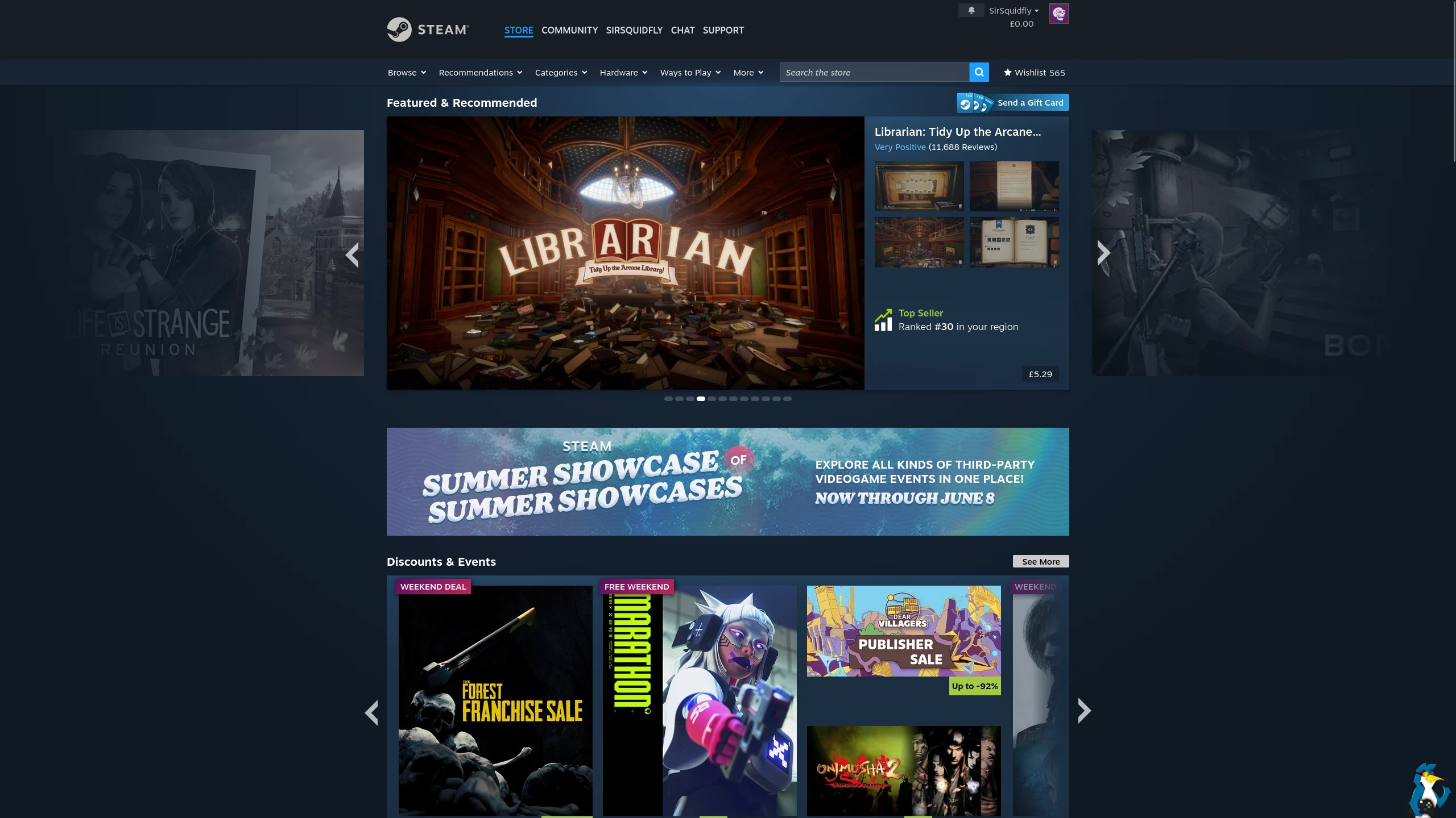
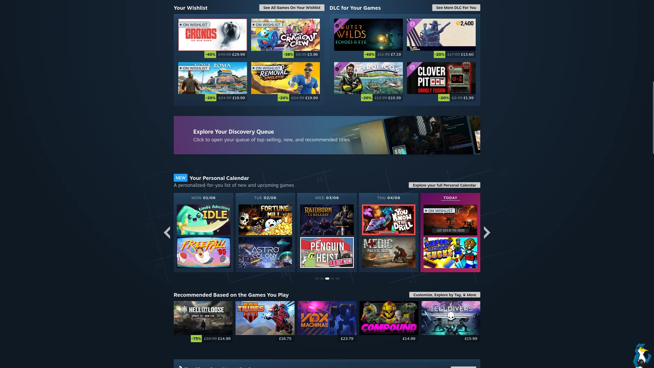
Like the mouse highlight over recommendations - the pop-up UI will give you some more clear information about it without you having to go direct to the game page. You'll also notice the sections for games on sale from your wishlist and recommended DLC are sticking around permanently now, instead of just during sales events. And, that fancy personalized release calendar they made is actually showcased on the home page now too - that covers recently releases and upcoming games. Quite useful overall!
Everything should just look better too - thanks to higher resolution game art.
Finally as well, the store might not be quite so terrible to use on Steam Deck / SteamOS and Desktop Big Picture Mode. Valve said there's been "significant improvements to navigation" for anyone using a gamepad there which is good to see, sure took a while though. At least when the Steam Machine finally releases this summer, it might not see so many complaints about shopping for new games on it.
See it all on the Steam Store and the blog post announcement.
What do you think to the changes?
See more from me


 mi1stormilst 6 hours ago

I have to scroll or muck around to get to what I actually want to see when I am in the mood to shop/browse for a game. What I would like to see when I land on the store is something like this:
0.) Top indie titles in last 30, 90, 120 days.
1.) Top titles purchased in last 30, 90, 120 days.
2.) Top titles by number of players in last 30, 90, 120 days.
3.) Top reviewed titles by genre in last 30, 90, 120 days.
4.) Current sales on my wishlist items.
5.) Filters and lists for genres, sale, multiplayer, etc.
6.) General sales and promotions.
7.) Everything else.
 Liam Squires-Hand 6 hours ago

Quoting: deckgamerI wish I knew what Valve is really doing to its own store that would explain why is it that after all this time it's still a pain to see Steam Deck reviews on the handheld. I can easily browse the store on my phone and use the "playtime > Steam Deck reviews" filter and doing so on Desktop mode on the Deck is also achievable but did they really think having to deal with switching modes in order to see SD reviews would be ideal? I mean, come on.I think a lot of the issue comes down to using the same store across different platforms - rather than being specifically tailored to each.
At least typing seems to work on the workshop page, really like the new workshop layout, store page doesn't seem that "improved" to me though, just different