While you're here, please consider supporting GamingOnLinux on:
Reward Tiers: Patreon. Plain Donations:
  PayPal.
This ensures all of our main content remains totally free for everyone! Patreon supporters can also remove all adverts and sponsors! Supporting us helps bring good, fresh content. Without your continued support, we simply could not continue!
You can find even more ways to support us on this dedicated page any time. If you already are, thank you!
Reward Tiers:
This ensures all of our main content remains totally free for everyone! Patreon supporters can also remove all adverts and sponsors! Supporting us helps bring good, fresh content. Without your continued support, we simply could not continue!
You can find even more ways to support us on this dedicated page any time. If you already are, thank you!
Login / Register
- New US Congress bill proposal requires all operating system providers to verify ages [updated]
- Mozilla announced "Thunderbolt", their open-source and self-hostable AI client
- US operating system age verification bill "Parents Decide Act" gets published
- Dune: Awakening to get self-hosted servers, plus they're splitting PvE and PvP
- Amazon Luna rips out game stores, game purchases and third-party subscriptions
- > See more over 30 days here
Recently Updated
- Testing the VRAM valve patch
- Koopa - New Desktop Screenshot Thread
- tmtvl - Shop Crush - Psychological Horror Thrift Sim with Literal Illusio…
- hollowlimb - Proton/Wine Games Locking Up
- Caldathras - video buffer overflow
- LoudTechie - See more posts
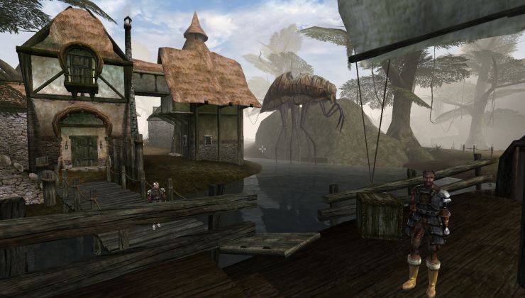
 How to setup OpenMW for modern Morrowind on Linux / SteamOS and Steam Deck
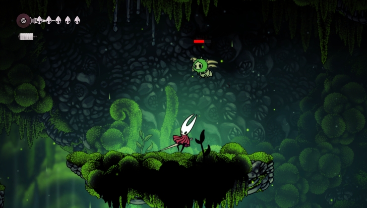
 How to install Hollow Knight: Silksong mods on Linux, SteamOS and Steam Deck
[center][img=241x252]http://i288.photobucket.com/albums/ll175/AlexVSharp/Mock%20Ups/GOL/Liam2_zps37bd5d0a.jpg[/img][/center]
I encourage you all to give your opinions about what to do where and how (with a good dose of why mixed in there) so that we can have Mr. Mascot here up and ready. Also if someone would like to try their hand in editing him, contact me via a PM and I can arrange to have the original SVG sent.
btw, he needs a proper name.
I just keep naming the file "Liam" so I know who it's for... Shame on me. :whistle:
Could he maybe have a mouse hanging from his other hand? Might look quite cool.
I know I said to remove "GOL" from the laptop but do you think it could be on it just a different position? Like GOL going vertical down the right of the laptop?
Really looking crisp now!
About its name, I suspect GOLLUM (Gaming On Linux's Lovely and Unique Mascot) is out of the question, right? :D
Could you make Penguin a little more plump?
I have no objections.
"My precious...!" ;)
Best I leave this to be decided by a majority vote.
Love how you made the acronym though.
I could try, but I'm afraid that, since he's shorter now, further alterations to his stomach could make him look way too fat. I'm not sure: How much do we want him to be in shape anyway?
btw, Why'd you remove that mockup you made?nvm, found it.Was going to suggest altering it a bit and using it for the new site's 404 page.
Alex V.Sharp how do You feel about changeable accessories in Your logo. Mr. Xut(or Mrs, it's a penguin) might be holding different thing depending on the date(bodypillow with Linus Torvalds on his birthday or something) , article category and so on.
As for a changing logo, I would prefer to keep it static now so we have a sort of proper brand people can associate with the website.
Also, lets save [alpha transparency](http://caniuse.com/png-alpha).
I also think GOLLUM is a funny name Alex, maybe we should roll with that?
I think his weight is fine, he is supposed to stand for Linux being cool so making him fat I don't think really "fits" ;)
Alex, instead of him holding a mouse maybe he could be grabbing the G in the Gaming On Linux text?
This is a good idea actually. The logo would be always the same (static) however we could have small variations on specific dates. Kind of like what Google does with their logo: with a little hint about what's happening on an interesting day. Might be a cool idea, and since it'll always be the same bushy-eyebrows tech-sunglasses wearing blue penguin I believe it will only expand the 'brand'. I can even (in due time) upload an easy-to-edit SVG file for other users to download and make their own little alterations, so we can hold design competitions for certain events too.
For now I would rather we focus on getting the main bases completed so we can push ahead with the new design and work on other season/people focused additions to GOLLUM later.