While you're here, please consider supporting GamingOnLinux on:
Reward Tiers: Patreon. Plain Donations:
  PayPal.
This ensures all of our main content remains totally free for everyone! Patreon supporters can also remove all adverts and sponsors! Supporting us helps bring good, fresh content. Without your continued support, we simply could not continue!
You can find even more ways to support us on this dedicated page any time. If you already are, thank you!
Reward Tiers:
This ensures all of our main content remains totally free for everyone! Patreon supporters can also remove all adverts and sponsors! Supporting us helps bring good, fresh content. Without your continued support, we simply could not continue!
You can find even more ways to support us on this dedicated page any time. If you already are, thank you!
Login / Register
- Oh dear - ARC Raiders was logging your private Discord chats [updated]
- California law to require operating systems to check your age
- Ubuntu and Fedora devs comment on California's new Digital Age Assurance Act
- Valve reconfirm the Steam Frame, Steam Machine and Steam Controller are due in 2026
- SteamInputDB is a new site to help you find Steam Input configurations for your gamepads
- > See more over 30 days here
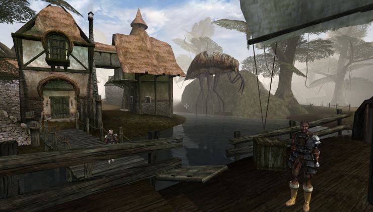 How to setup OpenMW for modern Morrowind on Linux / SteamOS and Steam Deck
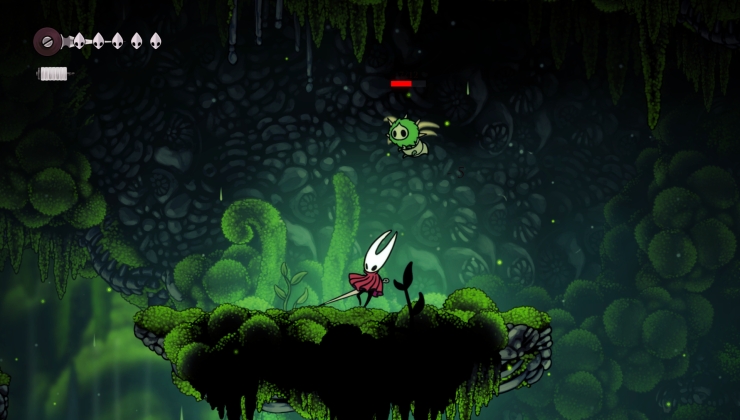 How to install Hollow Knight: Silksong mods on Linux, SteamOS and Steam Deck
Recently Updated
The "Send Correction Report" button that is on the right-hand side of the box to write a comment is, to my blind eyes, confusing.
I have pressed it several times when trying to reply to a quick comment. IMO, it would be a much better place to be located right under the post when we're more likely to press it if we see a typo, etc. Or at least a different colour palette than Post comment or Preview comment.
Thanks! :)
Last edited by GamingOnLinux Bot on 23 Jan 2021 at 12:27 pm UTC
Might swap it around to have the main action button as a different colour, will experiment a little but for now the JS alert will help.
Last edited by GamingOnLinux Bot on 7 Jan 2021 at 2:17 pm UTC
Edit: went over the CSS styles and adjusted. All forms should now use a primary bright colour for the main action (posting / editing) and all others not. This should solve the problem.
Last edited by GamingOnLinux Bot on 12 Jan 2021 at 2:42 pm UTC