The latest update to the GNOME desktop environment has been released, with GNOME 47 bringing some really quite lovely sounding improvements. I do have to admire how ridiculously clean GNOME looks and feels when using it, even if it's not my preferred desktop.

Pictured - GNOME 47
Some of the changes include:
- Accent Colours to customize your desktop style some more.
- Enhanced Small Screen Support.
- Screencast Hardware Encoding.
- Faster, More Accurate Rendering.
- Persistent Remote Desktop Sessions.
- New style for Dialog Windows.
- New Open and Save File Dialogs integrated into the Files app.
- Improved Files app with a better search system, more interface modernizations.
- Improved Online Accounts system with new features.
- Lots of bug fixes to GNOME Calendar.
- Disk Usage Analyzer has a refreshed interface for GNOME 47.
- An enhanced fractional display scaling feature.
Check out their release video:

YouTube videos require cookies, you must accept their cookies to view. View cookie preferences.
Direct Link
Direct Link
All the details in the release notes. You can either wait until your chosen Linux distribution updates, or give it a spin using the GNOME OS nightly images.
What's your favourite improvement in GNOME 47?
About the author - Liam Dawe
I am the owner of GamingOnLinux. After discovering Linux back in the days of Mandrake in 2003, I constantly checked on the progress of Linux until Ubuntu appeared on the scene and it helped me to really love it. You can reach me easily by emailing GamingOnLinux directly. You can follow me personally on Mastodon [External Link].
See more from me
See more from me
Some you may have missed, popular articles from the last month:

All posts need to follow our rules. Please hit the Report Flag icon on any post that breaks the rules or contains illegal / harmful content. Readers can also email us for any issues or concerns.
25 comments
 CalebQ42 21 Sep 2024

Quoting: JarmerTo me there seems to be just a fundamental misunderstanding from the gnome team about the dimension of ... a screen. You know. The thing you use this software on. I have NEVER understood it. I simply can never use it because of this.On vanilla Gnome, you only have a slim top bar; the bottom app bar is an extension (I don't use and don't like personally) that a lot of distros have installed and enabled by default.
Every single screen on earth is a horizontally wide screen. So gnome puts a gigantic bar across the entire top of the wide screen, which is like 95% unused empty space. For what reason? And then puts ANOTHER horizontal bar across the bottom with apps on it with HUMONGOUSLY GIGANTIC icons for .... reasons?
So they squish the usable space vertically FAR more than it needs to be. And without using hacks / extensions you can't configure it to a single panel on the left or right or top or bottom (but I admit I haven't used it in a long time so not sure if recent updates have changed it).
1 Likes
CalebQ42 21 Sep 2024
Quoting: Leahi84I REALLY don't like gnome. It looks too much like something Apple would make. I'll be sticking with KDE for the far foreseeable future.KDE looks too much like something Microsoft would make :P
2 Likes
walther von stolzing 22 Sep 2024

Quoting: pleasereadthemanualbut to even get the file path to display in Finder you need to head to the command line.
View -> Show Path Bar displays the file path just above the status bar.
0 Likes
pleasereadthemanual 22 Sep 2024

Quoting: wvstolzingThe first answer I found with a search engine was a stackoverflow post with a command, but it's good to know there's actually a way to do this in the UI.Quoting: pleasereadthemanualbut to even get the file path to display in Finder you need to head to the command line.View -> Show Path Bardisplays the file path just above the status bar.
0 Likes
 neolith 23 Sep 2024

Quoting: JarmerTo me there seems to be just a fundamental misunderstanding from the gnome team about the dimension of ... a screen. You know. The thing you use this software on. I have NEVER understood it. I simply can never use it because of this. [...]That is one of the things that distub me the most about GNOME – it seems hellbent on wasting my screenspace.
0 Likes
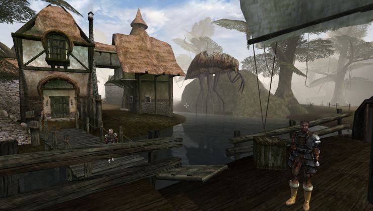 How to setup OpenMW for modern Morrowind on Linux / SteamOS and Steam Deck
 How to install Hollow Knight: Silksong mods on Linux, SteamOS and Steam Deck