Those of you who follow us on twitter @gamingonlinux will know I have been working on a new website for us for many reasons
It is now ready for wider testing: www.prxa.info
Please tell me of any bugs you find and give your suggestions.
I am aiming to have it live by the end of the month.
Features not in:
Editors can't yet auto post to front page without the post going in my admin queue.
No share to social networks on articles.
Ignore:
Ignore messed up bbcode styling on home page articles, it's from the importer from this software which i will clean up as i go (not doing it now as it will be wiped and re-imported before it goes live)
I need from you lot:
More logos! At the moment we are only using one logo the christmas themed one but usually we have 3 in rotation, I want more so submit them if you fancy getting your work on here!
Why?
The website is not for me, but for everyone, can we make it a group effort? Either way this current website has to be replaced due to:
1)The software costs money
2)It's hard to style and extend as i don't know the code
3)It's not being updated by the authors for security fixes, bugs etc
4)The software itself may not be legal, vbulletin is suing xenforo
Some you may have missed, popular articles from the last month:
All posts need to follow our rules. Please hit the Report Flag icon on any post that breaks the rules or contains illegal / harmful content. Readers can also email us for any issues or concerns.


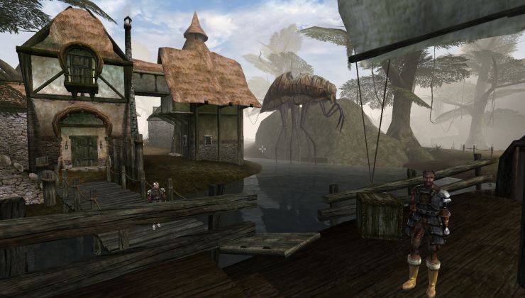 How to setup OpenMW for modern Morrowind on Linux / SteamOS and Steam Deck
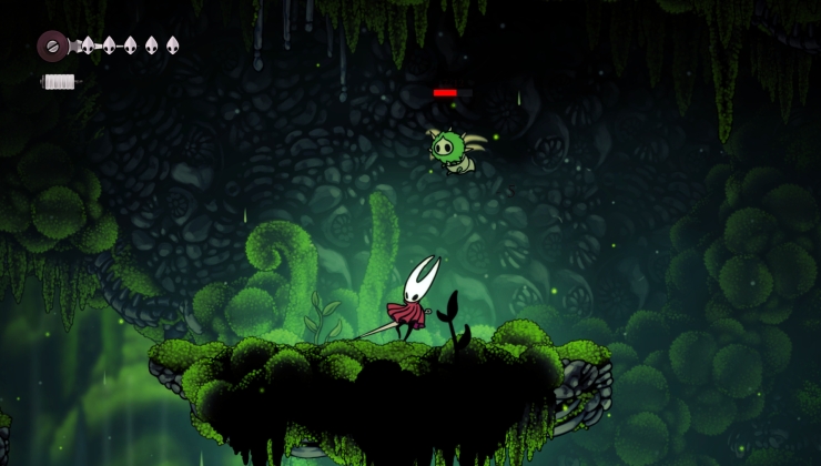 How to install Hollow Knight: Silksong mods on Linux, SteamOS and Steam Deck